When you walk down the street and turn your head, you’re not just surrounded by brands and billboards, but also by logos and their stories. From every street vendor to every paan shop, there’s a name, a colour scheme, and symbols at play. But ask yourself: do you remember their names? Chances are, only those with a solid, cohesive identity across both online and offline channels stick with you.
This is where the power of a well-crafted logo comes into play. A logo isn’t just a pretty picture; it’s the face of your brand, the first impression, and the silent storyteller. It encapsulates your brand’s essence, history, and promise to consumers. A well-designed logo can make the difference between being just another name in the crowd and becoming a memorable icon that commands loyalty and recognition.
As the leading creative agency in Kolkata, we’re here to decode brand logos and the stories behind them. Let’s explore how a logo can elevate your brand’s positioning—through the Brew-Lens.
- Brand Recognition and Recall: Imagine a world where every company used generic symbols. How would you differentiate between them? A strong logo acts as a visual cue, helping customers instantly recognize and remember your brand. It’s like a visual trigger that sparks positive associations and memories. Think of the golden arches of McDonald’s or the swoosh of Nike – these logos are instantly recognizable across the globe. Studies have shown that brand recognition can increase purchase intent by up to 80%.
- Storytelling and Emotional Connection: A logo can be a powerful storytelling tool. Through its design elements – colours, shapes, fonts – a logo can communicate your brand’s values, personality, and mission statement. Consider Apple’s minimalist apple logo, which evokes a sense of innovation and sleek design. Or the vibrant colours and playful font of Baskin Robbins, which instantly convey a sense of fun and indulgence. A well-crafted logo creates an emotional connection with your audience, making them feel something about your brand. Research suggests that emotions play a significant role in consumer decision-making, with 80% of purchasing decisions being driven by emotions rather than logic.
- Building Trust and Credibility: In a world saturated with brands, a professional logo instils a sense of legitimacy and inspires confidence in consumers. A sloppy or generic logo can send the opposite message, making your brand appear unreliable or untrustworthy. A well-designed logo, on the other hand, communicates professionalism and attention to detail, giving customers a reason to trust your brand. Studies have shown that 73% of consumers are more likely to do business with a company they trust.
- Competitive Advantage: Your logo is a key differentiator in a crowded marketplace. It helps you stand out from the competition and carve a unique niche in the minds of consumers. When done right, your logo can become a symbol of quality and reliability, attracting customers who resonate with your brand story. According to a study by Siegel+Gale, companies with strong brand identities outperform their competitors by 223% in stock performance.
Beyond Aesthetics: Why Logo Is Not Just An Art Project
How can a logo transform a brand’s image? It’s not just about pretty colours and trendy fonts. Here are some key considerations for designing a powerful logo:
- Brand Identity: Before even touching the design software, delve deep into your brand’s core identity. What are your values, mission, and target audience? Understanding these aspects will guide your design choices and ensure the logo reflects the essence of your brand.
- Simplicity and Versatility: A logo should be memorable and impactful. Complex designs can be visually overwhelming and difficult to recall. Strive for simplicity and clean lines. Remember, your logo needs to look good not just on a billboard, but also on a tiny favicon or a social media profile picture.
- Colour Psychology: Colours evoke emotions and have cultural associations. Choose colours that align with your brand message. For example, blue is often associated with trust and security (think: Facebook, PayPal), while red conveys energy and excitement (think: Coca-Cola, Netflix). Look at the logo of Coca-Cola, which has remained largely unchanged for over a century – a testament to the power of a timeless design.
- Typography: The font you choose can speak volumes about your brand personality. Opt for fonts that are easy to read and complement the overall design aesthetic. A playful script font might be perfect for a children’s clothing brand (think: Disney), while a bold sans-serif font might suit a tech company (think: Google, Uber).
- Timeless Appeal: While trends come and go, a strong logo should have lasting appeal. Avoid overly trendy design elements that might date quickly. Look at the logo of BBC, which has evolved subtly over the years while maintaining its core recognizable elements.
Brand logos require extensive research and continual updates to accurately reflect the brand’s essence. The logos of major brands that we have admired and adored for decades each have their own unique stories. Here Are Some Fascinating Backstories of 8 Iconic Logos:
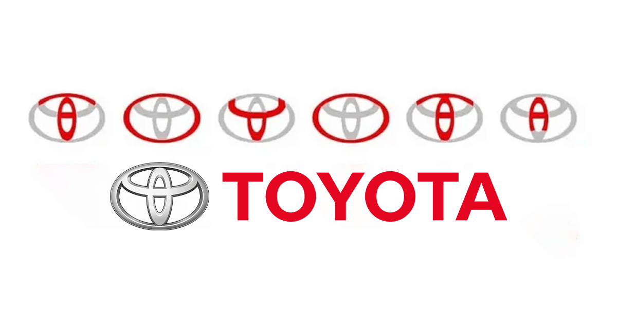
1. Toyota: From Loom to Trusted Mobility
Toyota’s original logo was a complex web of interlocking circles, representing a loom – the founder’s family business. Through several iterations, it transformed into the sleek, symmetrical emblem we know today. The logo incorporates every letter of the company name. The overlapping ellipses symbolise trust, global reach, and the technological innovation that drives Toyota forward.
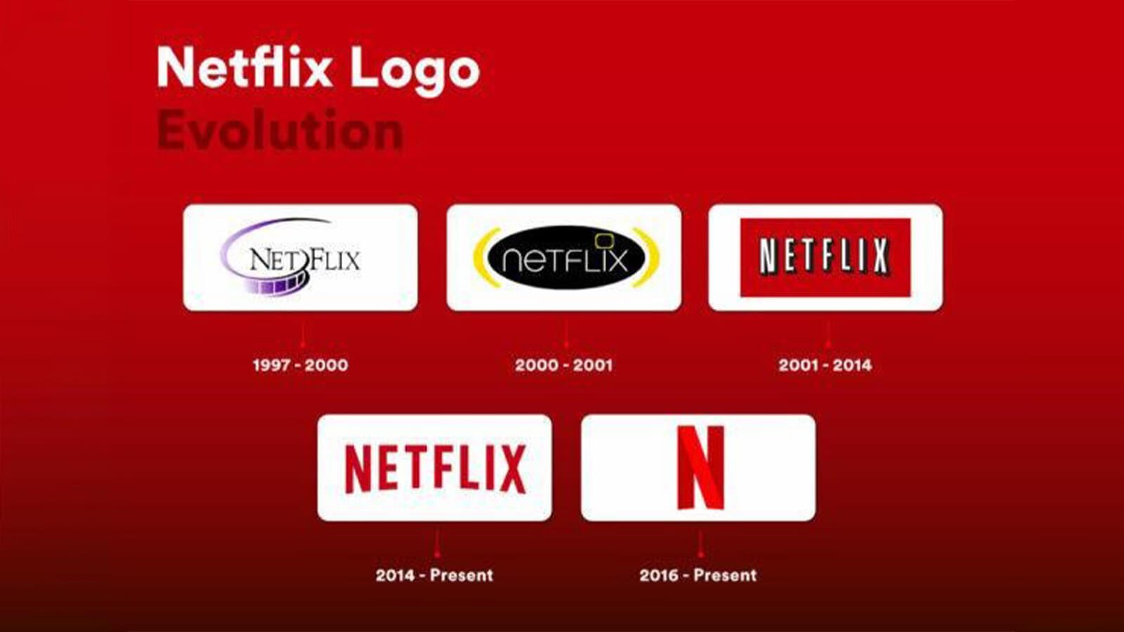
2. Netflix: From DVDs to Streaming Supremacy
Remember the iconic red Netflix envelope logo? It represented their original DVD rental service. As they pivoted to streaming, the logo evolved into a simple, elegant wordmark. This shift signifies Netflix’s adaptation to changing consumer behaviour and its focus on the digital entertainment experience.
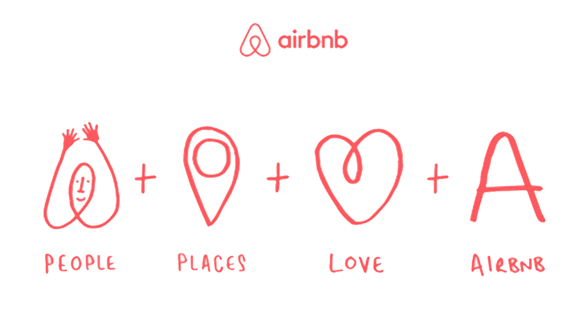
3. Airbnb: Belonging Anywhere
Airbnb’s logo is deceptively simple. The four interconnected shapes represent a host, a guest, a location, and a love for travel. Airbnb shows people, places, love, and the concept of “Air BNB,” emphasising that it helps people fall in love with the places they stay. This subtle symbolism conveys the core values of Airbnb: connection, community, and the joy of exploration.
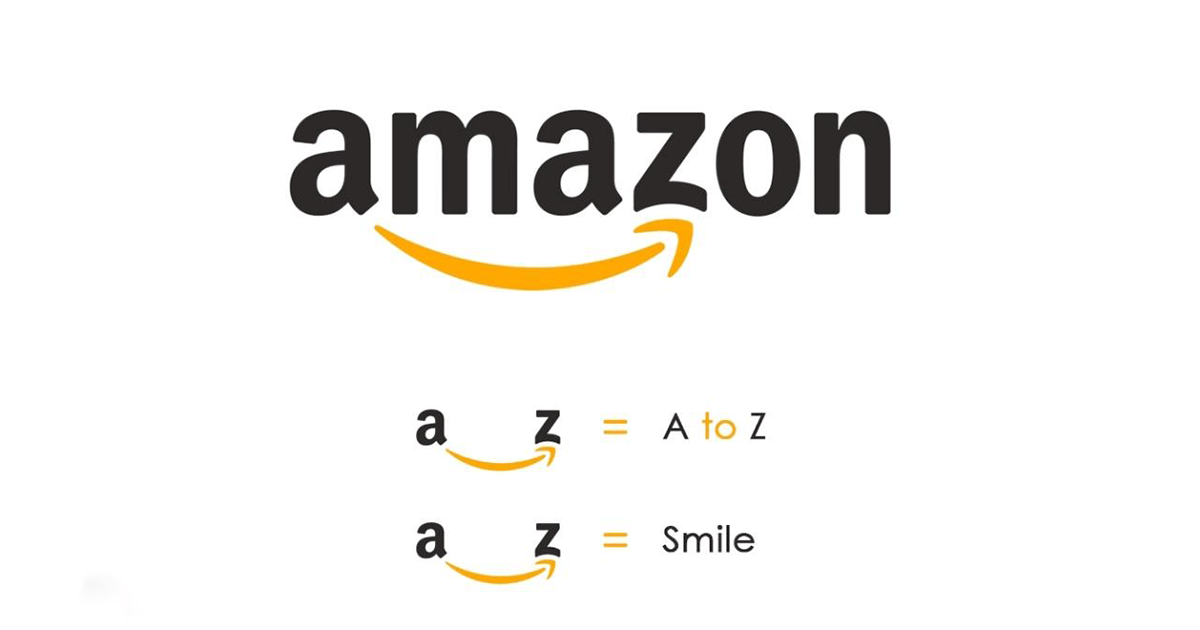
4. Amazon: A Smile That Says It All
Amazon’s logo is a stroke of genius. The arrow starting at the letter “A” and curving into a smile subtly communicates the vast selection of products available on their platform (from A to Z) and the satisfaction customers can expect. It’s a visual reminder of Amazon’s commitment to fulfilling customer needs
5. SBI: Stability and Trust
The SBI logo symbolises a keyhole, indicating that the common man can access all his banking needs. Initially, when first designed in 1955, the SBI logo featured a banyan tree. The colour blue here signifies the trust and growth.
6. Hyundai: A Handshake for Progress
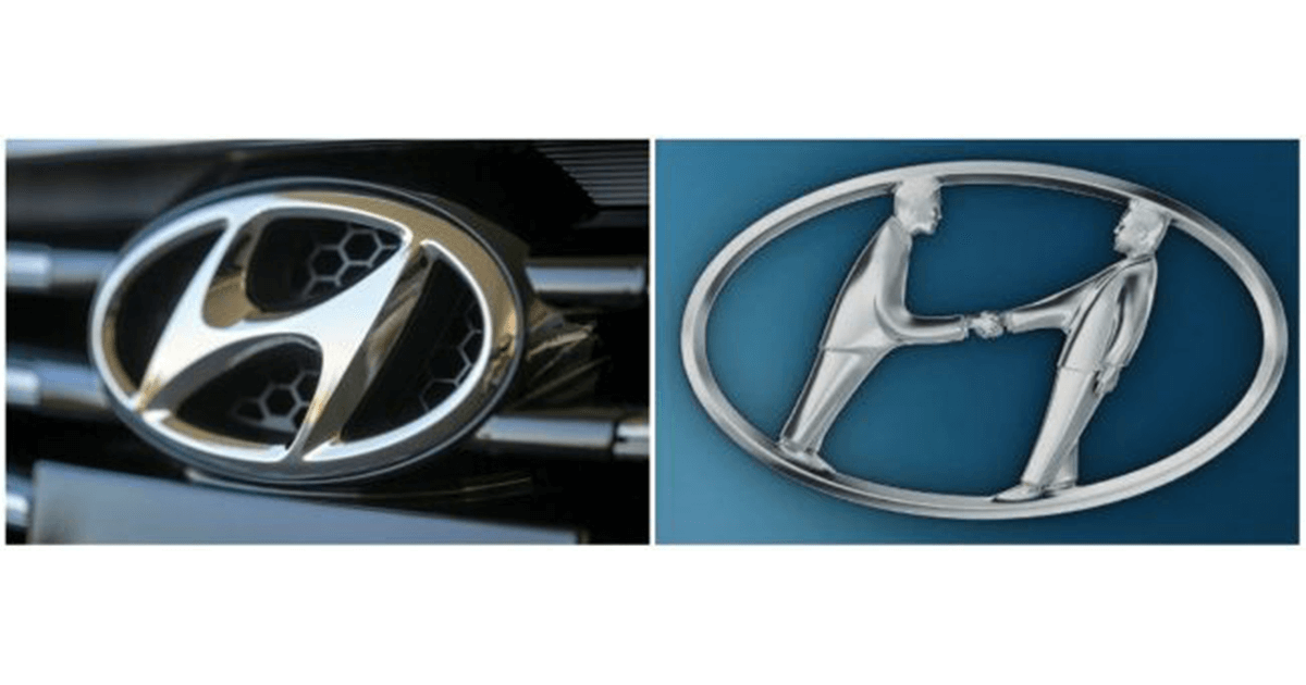
Hyundai’s logo depicts two figures shaking hands – a customer and a company representative. This simple yet powerful image embodies trust, partnership, and a commitment to mutual progress. It signifies Hyundai’s dedication to building strong relationships with its customers.
7. Baskin Robbins: A World of Flavor
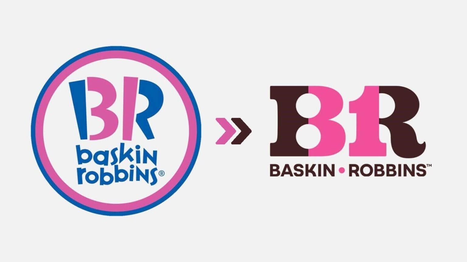
Baskin Robbins’ logo is a playful pink ribbon intertwined with 31 dots. The ribbon represents the deliciousness of their ice cream, while the 31 dots signify the 31 flavours they originally offered. It’s a fun and memorable logo that captures the brand’s spirit of variety and indulgence.
8. Unilever: Sustainable Living
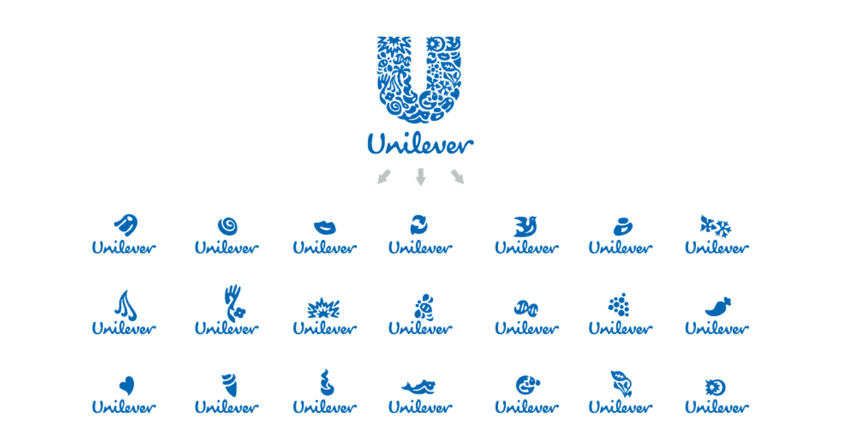
Unilever’s logo is a dynamic “U” formed by 25 icons representing the diverse categories and sustainability initiatives the company embraces. This visual tapestry reflects Unilever’s commitment to a healthier future for both people and the planet.
These brands have set the bar so high that logos have become synonymous with meaningful art. Each logo embodies an in-depth concept that reflects the brand’s history and identity, built on elements such as consumer trust, communication tone, and social positioning.
To create a cult brand, it all begins with the logo. Let’s focus not just on creativity but also on strategy. Consider us your artists, ready to paint your brand’s story. As a creative agency in Kolkata from logo design to stationery, we can shift your consumers’ perspectives, making them loyal to your brand despite tempting offers from competitors.
Ready to try our Gr8 Brew? Contact us.


