Imagine a person at a party:
Logo is the person’s name tag – it’s the first thing you notice and helps you identify them instantly. It’s the looks or how the person appears, it’s concise, memorable, and visually appealing, similar to how a logo should be.
Branding represents the person’s entire personality. It covers everything about a person, from how they act to their personality traits, whether they’re funny, formal, traditional, or modern. It describes every detail comprehensively.
- Values and beliefs: What they stand for, just like a company’s mission and vision.
- Communication style: How they talk and interact with others, similar to the brand’s voice and messaging.
- Fashion choices: What they wear reflects their personality, just like the brand’s colours, fonts, and design aesthetics.
- Behaviour: How they act and treat others, analogous to the brand’s customer experience and service.
Rebranding: This person decides to change their style and behaviour to better align with their values and attract new friends (target audience). They might:
- Change their clothes: Update the logo and visuals.
- Develop a new communication style: Refine the brand voice and messaging.
- Adopt new habits: Enhance the customer experience and service.
Connecting the Dots:
Putting aside the analogy, it can be stated that just as a person’s face represents them, a company’s logo serves as its face, facilitating immediate recognition. Nevertheless, branding extends well beyond the visual scope. It encompasses the entire persona, embracing the company’s values, communication approach, conduct, and the overall encounter it offers to its audience.
New Logo vs. Rebranding: The Key Differences

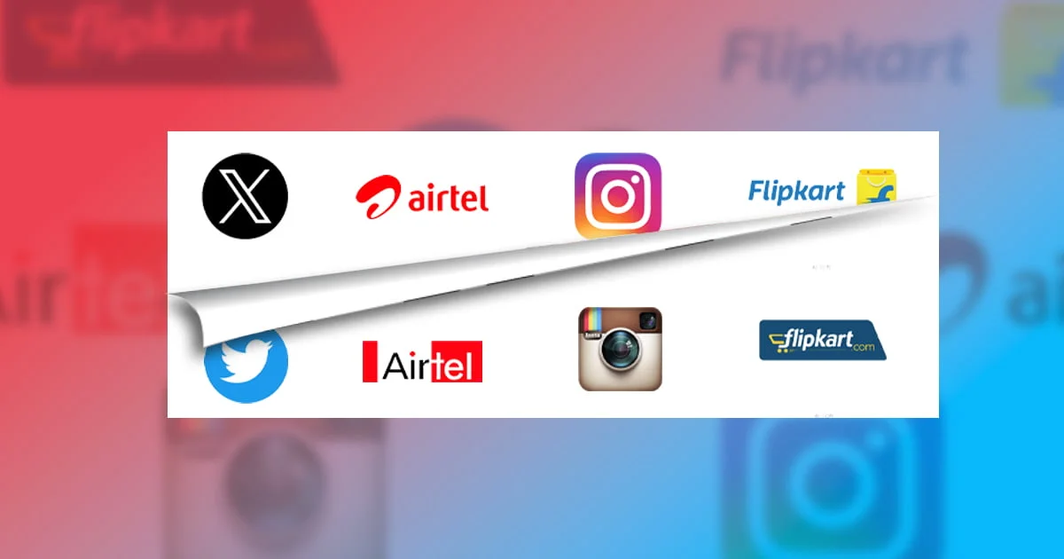
Here are five famous examples of iconic logo changes and rebranding in recent times:
1. X (Formerly Twitter):
- Original Logo (2006): A small, detailed blue bird facing left, resembling a lowercase “t”.
- Current Logo (2023): The fresh X logo adopts a minimalist, monochrome design, aligning closely with Elon Musk’s vision for Twitter. It symbolises the exchange of ideas characteristic of the platform.
- Impact: This was a complete rebranding, focusing more on future generations and upgraded technology. Elon Musk acquired Twitter last year and established a new parent company, X Corp. Former Twitter is now X, an application by X Corp.
2. Instagram:
- Original Logo (2010): A brown and orange Polaroid camera icon.
- Current Logo (2016): A minimalist gradient of orange, purple, red, and yellow representing a more abstract and artistic take on a camera.
- Impact: Instagram’s rebranding reflected the platform’s evolution beyond just photo sharing, encompassing a wider range of visual content creation. The logo change signalled a shift towards a more modern and artistic identity.
3. Flipkart:
- Original Logo (2007): A basic blue and orange logo with an “F” and the company name in a simple font.
- Current Logo (2018): A vibrant yellow and blue logo with a more modern and dynamic “F” design.
- Impact: Flipkart’s logo change aimed to reflect its growth and leadership in the e-commerce market. The new logo represented a more contemporary and energetic brand image.
4. Airtel:
- Original Logo (Pre-2010): A red globe with white continents and the Airtel name in a basic font.
- Current Logo (2010): A vibrant orange and white “A” symbol with a dynamic wave design.
- Impact: Airtel aimed to project a more youthful and dynamic brand image. The logo change signalled its focus on innovation and customer connection in the telecom industry.
Whether it’s a logo change or a 360-degree rebranding effort, everything must be meticulously planned and executed with a strategic approach. The primary objective is to establish a connection with the audience. Failure to resonate with consumers can lead to significant setbacks and losses.
Research conducted by Landor Associates suggests that a well-planned rebranding initiative can potentially increase brand recognition by up to 80%. Conversely, a study by Siegel+Gale revealed that 33% of consumers would discontinue using a brand if they disliked the new logo.
Navigating the world of branding is like handling a double-edged sword. Allow us to look into your company’s needs and goals through Brew-Lens.
Trust the best branding agency in Kolkata to build your brand so strong that it stands out and captivates attention, even in today’s fiercely competitive landscape where new competitors pop up daily!
Getting Started Is Easy! Write to us @ Gr8 Brews & Get A Free Consultation!


