Imagine you’re on a bike trip to Ladakh, heading to the stunning Pangong Lake. The ride is long, the cold starts to bite, and boredom sets in. Suddenly, you spot a Maggi point and feel an overwhelming surge of joy. That hot bowl of Maggi is pure bliss. But as you hit the road again, the terrain becomes rough and challenging. Frustration creeps in, and you might even feel like giving up on your journey to Pangong.
Now, think of this as a metaphor for a consumer’s journey while making a purchase on a product website. Just like your ride, their experience has highs and lows. The key to keeping them on the path and ensuring they reach the finish line is creating moments of delight along the way. These delight factors not only engage customers but also convert them into loyal advocates for your brand.
As users scroll through a website, they interact with various touchpoints. But how are these touchpoints mapped? This is where heatmaps work their magic! As a 360 degree digital marketing agency in Kolkata, let Gr8 Brews guide you through this journey with this blog:
What Are Website Heatmaps and How Do They Work?
Website heatmaps are visual tools that showcase user interactions on a webpage. These maps use color gradients to represent the frequency and intensity of engagement. Warm colors like red and orange highlight areas with higher user activity, while cool colors like blue and green indicate less interaction.
Heatmaps track multiple behaviors, such as:
- Clicks: Identifying where users click the most.
- Mouse movements: Showing areas of focus or interest.
- Scroll depth: Revealing how far users scroll down a page.
- Eye tracking: Indicating where users’ gaze lingers.
Types of Heatmaps and Their Applications
Different heatmap types serve specific purposes in understanding user behavior. As a 360 degree digital marketing agency, let us break it down to you:
1. Click Maps
Click maps reveal where users click on a page. These insights help identify:
- Areas users expect to be clickable.
- Performance of call-to-action (CTA) buttons.
- Navigation effectiveness.
Example: If a CTA button receives fewer clicks, marketers can test changes in its size, color, or placement to boost engagement.
2. Scroll Maps
Scroll maps show how far down users scroll on a page. The warmest zones indicate the sections most viewed, while cooler areas mark drop-offs. These maps are invaluable for optimizing page layouts by:
- Positioning key content in high-engagement areas.
- Adjusting the flow to retain user interest. A study by Nielsen Norman Group found that 57% of viewing time on a web page is spent above the fold, emphasizing the importance of optimizing this area.
3. Movement Maps (Hover Maps)
Movement maps track mouse movements, often correlating with eye focus areas. These maps help:
- Identify which elements users pay attention to.
- Position critical information effectively.
4. Eye-Tracking Maps
Eye-tracking maps use advanced technology to monitor where users’ eyes focus. This data can:
- Highlight distracting elements to remove.
- Ensure CTAs and key messages receive maximum visibility.
5. Engagement Zone Maps
These maps combine data from clicks, movements, and scrolls to identify high-interaction zones. Marketers can use them to optimize page design for maximum engagement.
6. Rage Click Maps
Rage click maps show where users repeatedly click out of frustration. This data highlights:
- UX roadblocks.
- Technical glitches or misleading elements.
How Heatmaps Enhance Marketing Strategies
Gr8 Brews, as the top 360 degree digital marketing agency always encourages to use heatmaps as it provides both qualitative and quantitative data, helping marketers make informed decisions. Here’s how they contribute to effective marketing strategies:
1. Improve Cross-Device User Experience
User behavior varies across devices. Desktop users may click less or scroll minimally, while mobile users often scroll extensively. Heatmaps help tailor content and CTAs for specific devices, ensuring a seamless experience.
Example: Mobile heatmaps might show that users engage more with content placed further down the page, prompting marketers to optimize layout accordingly.
2. Boost Conversion Rates
Heatmaps reveal why users might not be engaging with CTAs. Marketers can test different colors, sizes, or placements based on click data to increase conversion rates. According to HubSpot, buttons with contrasting colors convert 21% better than less noticeable ones.
3. Optimize Key Pages
Focusing on high-traffic pages like homepages, landing pages, and blogs can yield significant returns. Scroll maps, for instance, can show where readers lose interest, guiding content restructuring to enhance engagement.
4. Run A/B Tests
Heatmaps are integral to A/B testing, helping marketers visualize the impact of layout changes. For instance:
- Before testing: Click maps show users ignoring a CTA.
- After testing: Revised layout positions the CTA in a high-engagement zone, driving clicks.
5. Refine Content Placement
Placing essential information in areas of maximum visibility is crucial. For example, scroll maps may indicate users drop off before reaching testimonials. Marketers can move testimonials higher to improve their impact.
Examples of Heat Mapping by Popular Brands:
1. E-Commerce Platforms: Flipkart and Myntra

- Use Case: Heatmaps help these platforms analyze how users navigate their product pages, search filters, and check-out processes.
- Example: Flipkart used scroll maps to identify that users often dropped off before reaching the product reviews section. They repositioned the reviews higher on the page, leading to a 15% increase in engagement with reviews and higher conversion rates.
- Outcome: Enhanced user experience and better product trust building.
2. Food Delivery Apps: Zomato and Swiggy
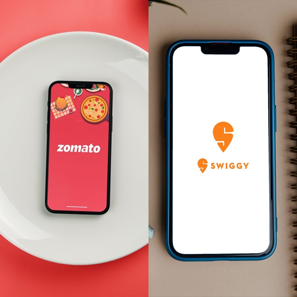
- Use Case: Heatmaps help optimize app interfaces for better order placement experiences.
- Example: Zomato used click maps to discover users frequently clicked on non-clickable restaurant images. By making these images interactive, Zomato improved navigation to restaurant menus by 20%.
- Outcome: Streamlined ordering process and increased user satisfaction.
3. Banking Websites: HDFC and ICICI

- Use Case: It optimises user journeys for services like credit card applications and loan inquiries.
- Example: ICICI used movement maps to see that users hovered around the “Contact Us” section but didn’t click due to unclear CTAs. By redesigning the button and improving its visibility, click-through rates increased by 18%.
- Outcome: Reduced friction in customer support interactions.
4. News Platforms: The Times of India
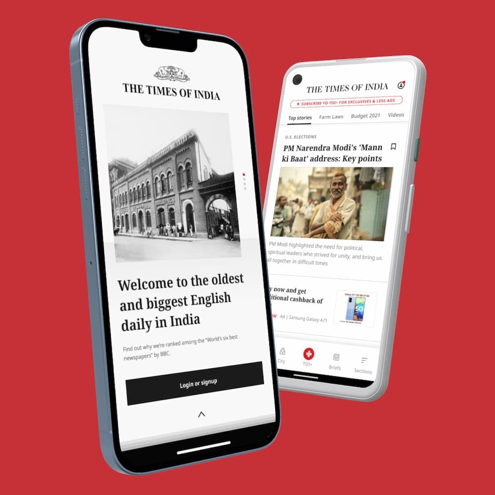
- Use Case: Heatmaps track how readers engage with news articles and ad placements.
- Example: The Times of India used scroll maps to identify that readers often skipped long opinion pieces. By breaking articles into shorter sections with jump links, they achieved a 30% improvement in page scroll depth.
- Outcome: Improved content accessibility and reader engagement.
5. OTT Platforms: Hotstar and Netflix India

- Use Case: It analyses how users browse through content categories and make viewing choices.
- Example: Hotstar used click maps to observe that users clicked repeatedly on thumbnails that didn’t provide enough information about the show. Adding hover previews to these thumbnails reduced bounce rates by 10%.
- Outcome: Enhanced user navigation and content discovery.
At Gr8 Brews, we believe in building brands that don’t just look good but “feel” right to your audience! As a leading 360 degree digital marketing agency in Kolkata, we make the websites hit with the power of heatmaps. By analyzing how users interact with your site, we fine-tune your content to match what your visitors love, making sure every click counts. We use insights from top tools like Crazy Egg, Hotjar, and Microsoft Clarity, to maximize your marketing ROI by focusing on what works, boosting your brand’s growth and loyalty. Why wait for negative feedback to pile up and potential audiences to slip away? Build a website that evolves and improves every day. Connect with us!


